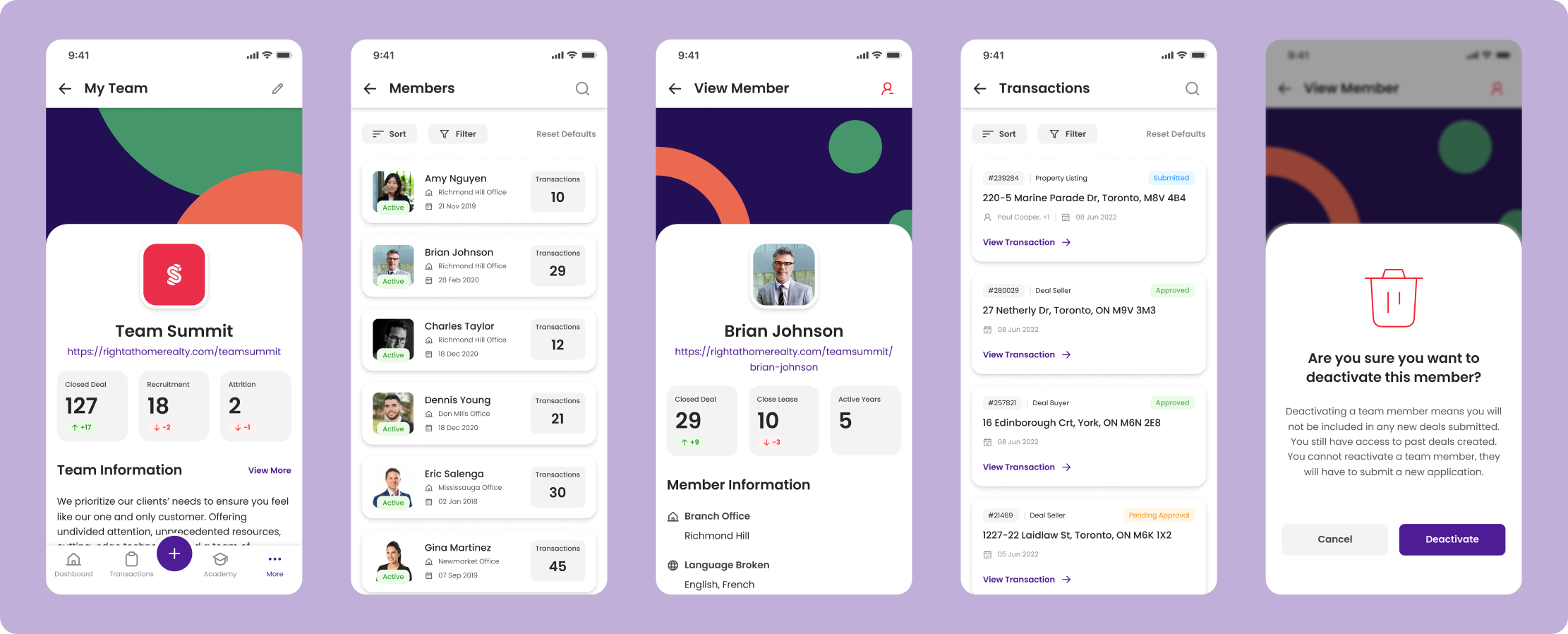
A desktop platform and mobile application to assist real estate agents with daily activities as well as boost overall productivity based on broad user demographic of real estate agents.

The objective of designing a real estate mobile app came after the completion of an online portal. The goal was to use the existing infrastructure, and create a simple way of using it on the go. As an agent, having access to a plethora of real estate resources in their pocket is a game changer.

I lead design for the workflow for team leaders. These leaders often have multiple members under them at their brokerage. The team leaders needed to have features such as viewing members, editing members, creating worksheets for members, deal creation for teams, etc.

To ensure the application met the needs of the target user group, usability testing was conducted. Using Maze, the design team was able to collect insights and data from the functional prototype of the app. Using this data, we were able to apply any necessary changes or updates to make sure the app conformed to the needs of a real estate agent.

One crucial insight during this stage was the misclick rate of users managing their notifications. A swipe gesture was initially implemented, but user testing revealed a kebab menu icon was more coherent to the user demographic. With a large portion of users being over the age of 40, it was found that swiping gestures were not as user friendly as initially concluded.

